- 1
- 2
- 3
- 4
- 5
- 6
- 7
- 8
- 9
- 10
- 11
- 12
- 13
- 14
- 15
- 16
- 17
- 18
- 19
- 20
- 21
- 22
- 23
- 24
- 25
- 26
- 27
- 28
- 29
- 30
- 31
- 32
- 33
- 34
- 35
- 36
- 37
- 38
- 39
- 40
- 41
- 42
- 43
- 44
- 45
- 46
- 47
- 48
- 49
- 50
- 51
- 52
- 53
- 54
- 55
- 56
- 57
- 58
- 59
- 60
- 61
- 62
- 63
- 64
- 65
- 66
- 67
- 68
- 69
- 70
- 71
- 72
- 73
- 74
- 75
- 76
- 77
- 78
- 79
- 80
- 81
- 82
- 83
- 84
- 85
- 86
- 87
- 88
- 89
- 90
- 91
- 92
- 93
- 94
- 95
- 96
- 97
- 98
- 99
- 100
- 101
- 102
- 103
- 104
- 105
- 106
- 107
- 108
- 109
- 110
- 111
- 112
- 113
- 114
- 115
- 116
- 117
- 118
- 119
- 120
- 121
- 122
- 123
- 124
- 125
- 126
- 127
- 128
- 129
- 130
- 131
- 132
- 133
- 134
- 135
- 136
- 137
- 138
- 139
- 140
- 141
- 142
- 143
- 144
- 145
- 146
- 147
- 148
- 149
- 150
- 151
- 152
- 153
- 154
- 155
- 156
- 157
- 158
- 159
- 160
- 161
- 162
- 163
- 164
- 165
- 166
- 167
- 168
- 169
- 170
- 171
- 172
- 173
- 174
- 175
- 176
- 177
- 178
- 179
- 180
- 181
- 182
- 183
- 184
- 185
- 186
- 187
- 188
- 189
- 190
- 191
- 192
- 193
- 194
- 195
- 196
- 197
- 198
- 199
- 200
- 201
- 202
- 203
- 204
- 205
- 206
- 207
- 208
- 209
- 210
- 211
- 212
- 213
- 214
- 215
- 216
- 217
- 218
- 219
- 220
- 221
- 222
- 223
- 224
- 225
- 226
- 227
- 228
- 229
- 230
- 231
- 232
- 233
- 234
- 235
- 236
- 237
- 238
- 239
- 240
- 241
- 242
- 243
- 244
- 245
- 246
- 247
- 248
- 249
- 250
- 251
- 252
- 253
- 254
- 255
- 256
- 257
- 258
- 259
- 260
- 261
- 262
- 263
- 264
- 265
- 266
- 267
- 268
- 269
- 270
- 271
- 272
- 273
- 274
- 275
- 276
- 277
- 278
- 279
- 280
- 281
- 282
- 283
- 284
- 285
- 286
- 287
- 288
- 289
- 290
- 291
- 292
- 293
- 294
- 295
- 296
- 297
- 298
- 299
- 300
- 301
- 302
- 303
- 304
- 305
- 306
- 307
- 308
- 309
- 310
- 311
- 312
- 313
- 314
- 315
- 316
- 317
- 318
- 319
- 320
- 321
- 322
- 323
- 324
- 325
- 326
- 327
- 328
- 329
- 330
- 331
- 332
- 333
- 334
- 335
- 336
- 337
- 338
- 339
- 340
- 341
- 342
- 343
- 344
- 345
- 346
- 347
- 348
- 349
- 350
- 351
- 352
- 353
- 354
- 355
- 356
- 357
- 358
- 359
- 360
- 361
- 362
- 363
- 364
- 365
- 366
- 367
- 368
- 369
- 370
- 371
- 372
- 373
- 374
- 375
- 376
- 377
- 378
- 379
- 380
- 381
- 382
- 383
- 384
- 385
- 386
- 387
- 388
- 389
- 390
- 391
- 392
- 393
- 394
- 395
- 396
- 397
- 398
- 399
- 400
- 401
- 402
- 403
- 404
- 405
- 406
- 407
- 408
- 409
- 410
- 411
- 412
- 413
- 414
- 415
- 416
- 417
- 418
- 419
- 420
- 421
- 422
- 423
- 424
- 425
- 426
- 427
- 428
- 429
- 430
- 431
- 432
- 433
- 434
- 435
- 436
- 437
- 438
- 439
- 440
- 441
- 442
- 443
- 444
- 445
- 446
- 447
- 448
- 449
- 450
- 451
- 452
- 453
- 454
- 455
- 456
- 457
- 458
- 459
- 460
- 461
- 462
- 463
- 464
- 465
- 466
- 467
- 468
- 469
- 470
- 471
- 472
- 473
- 474
- 475
- 476
- 477
- 478
- 479
- 480
- 481
- 482
- 483
- 484
- 485
- 486
- 487
- 488
- 489
- 490
- 491
- 492
- 493
- 494
- 495
- 496
- 497
- 498
- 499
- 500
- 501
- 502
- 503
- 504
- 505
- 506
- 507
- 508
- 509
- 510
- 511
- 512
- 513
- 514
- 515
- 516
- 517
- 518
- 519
- 520
- 521
- 522
- 523
- 524
- 525
- 526
- 527
- 528
- 529
- 530
- 531
- 532
- 533
- 534
- 535
- 536
- 537
- 538
- 539
- 540
- 541
- 542
- 543
- 544
- 545
- 546
- 547
- 548
- 549
- 550
- 551
- 552
- 553
- 554
- 555
- 556
- 557
- 558
- 559
- 560
- 561
- 562
- 563
- 564
- 565
- 566
- 567
- 568
- 569
- 570
- 571
- 572
- 573
- 574
- 575
- 576
- 577
- 578
- 579
- 580
- 581
- 582
- 583
- 584
- 585
- 586
- 587
- 588
- 589
- 590
- 591
What colors increase sales in the online store?
How to attract as many customers as possible to the online store? In this case, it is important to use all the mechanisms, an important role of which plays the color of the design of the site.
In order to achieve the success of the online store, you should not only give priority to large-scale actions, but it is also important to pay attention and trivialities. Often it is the little things in their totality that outweigh the rest. They can lead to unprecedented success or complete collapse.

It is to such trifles and the importance of color in the design of the Internet store. A lot is said about the importance of design itself. After all, it affects the attendance of the resource. In addition, literate design often helps us at first glance understand the thematic focus of the site. However, sometimes the color plays a role in all this, sometimes they forget. But shades cause certain persistent associations, which can not but affect the attraction of customers. But how to use color for the benefit of your business? About this further, and will be discussed.
Background color of the online store
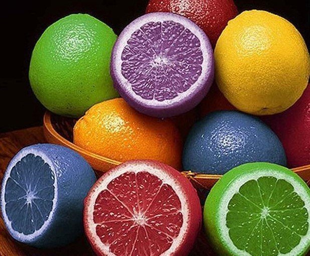
For the background of the online store is best to use light colors. Colors should be relatively neutral. However, a certain rule or norm, of course, does not exist. And do not forget that the background of the site is not an independent element. It also interacts with images, fonts and other content of the resource.
In the correct design solution, any background color can be used, but, as already mentioned, in combination with the rest of the online store. For example, a black or dark blue substrate can be used to emphasize the style of the product or to highlight it more. In addition, these shades will be associated with the fact that the products are rather designed for men rather than women, and even more so -than the children.
Consider the psychological influence of certain colors.
Red color
It makes people more energetic and excited. As a consequence, the desire to act immediately. Red is an excellent option for increasing the activity of customers. However, in excessive quantities, it can act irritatingly. And this, on the contrary, will frighten off visitors.
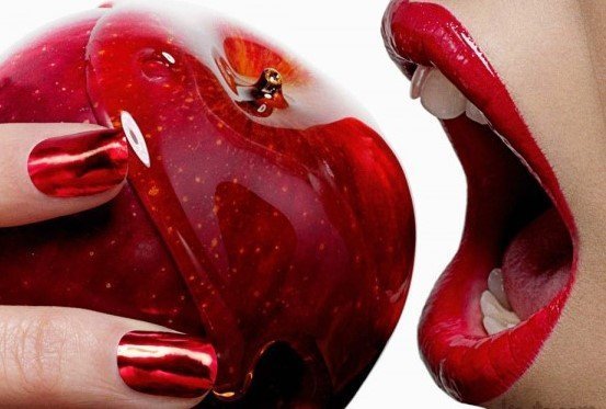
In moderate amounts, red is suitable for an online clothing store or food. It goes well with gray. However, on the resource associated with luxury products, it is better to abandon the use of red color.
Orange color
Just like red, it encourages people to act. However, it is less aggressive. Orange is associated with a festive atmosphere and joyful impressions. This color is perfect for any elements of the online store, which should be highlighted. Do you want to draw attention to the message about discounts or promotions? Feel free to use the orange in their design.
Yellow
Causes a feeling of joy, improves mood. Also associated with heat. If you want to create a sense of fun and celebration in your online store, then yellow is exactly what you need. In doing so, you can use a brighter shade to create a joyful atmosphere or slightly muted - for a sense of coziness. Experiment, and the result will pleasantly surprise you!

But remember that in large quantities, bright shades of yellow also act irritatingly. In addition, they can get tired eyes.
Green color
The first and most persistent association when seeing this color, of course, with nature. This shade is perfect for online stores that are associated with gardening, garden. Also you can use green if you offer eco-products to customers. It can be ecologically clean food or household chemicals, which does not pollute the environment.
Do not be green, just like red, use when decorating luxury goods.
Blue
Associated with friendliness and harmony. The blue color acts soothingly and soothingly. It is good to use in the Internet store, associated with the sale of children's clothing. Also blue, combined with other pastel tones, is perfect for hand-made paper products (postcards, albums, etc.).
Do not use blue for advertising or for promotional messages. Such ads will simply go unnoticed.
Dark Blue colour

Causes a sense of reliability. That is why its shades are trying to use large enterprises to provoke consumers' trust at the psychological level.
But remember that blue is a cold color, which means that its excessive use in the design of an online store can, on the contrary, alienate buyers. They will not feel the warmth and participation. Also, do not use the blue color on the site where food is offered.
Purple
It symbolizes everything mystical and mysterious. No less persistent associations and with a creative beginning.
Purple is perfect for an online clothing store and bed linen. In addition, it will be an excellent option if you offer your customers goods for any kind of creativity. The website of the online bookstore purple will also be relevant.
Pink color
Associated with tenderness. Causes a feeling of calm and pacification. In its characteristic, pink is something close to the blue color.
Pale shades of pink are perfect for online children's clothing stores. It will also work well on sites with products exclusively for women. However, do not forget about the thematic focus of the resource. For example, in the online store of sporting goods for women pink, however, is an inappropriate color.
Also, be careful with bright shades of pink. If you use them in combination with inappropriate colors, your online store will look tasteless. This can not be allowed in any case.
White color
Associated with cleanliness, sincerity and security. As a rule, the influence of white color on the appearance of the online store depends solely on other colors with which it is combined. So it all depends on the overall design decision.
In large quantities, white color is used on sites that sell medical products. In this case, it can be combined with blue or blue shades.
Black color
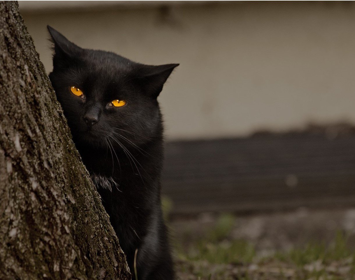
It is associated with elegance, refinement and power. It is for this reason that black color is often used in online stores of luxury products. In such cases, it is combined with gold and silver shades. In addition, white color can also be used.
Black color works well in online stores of clothing, accessories and cosmetics. Do not use it on sites that offer food, gardening products, as well as products for children.
On a note!
Try not to overload the design of your site with a large number of different colors. This will disperse the attention of buyers and distract from the main thing - from the products.
After the design of the online store is created, make sure that all necessary inscriptions are clearly visible and not lost on a bright or dark background.
Button color in the online store
Do not forget also that the color of the buttons plays an important role. Especially those who call for purchase and other actions.
In this case, remember that the colors are divided into warm and cold. It is the first at the psychological level that encourage people to act more actively. So, if you want to persuade a doubting customer to buy, then it's better to make buttons of orange, yellow or red.
How to choose the color of the design of the online store?

Before you finally decide on the color of the design of the online store, think about:
- Who is your target audience?
- What are the interests of these people?
- What exactly do they want to find?
You should understand that the online store offers buyers not only the goods, but also certain emotions. The external form of the site should evoke a very concrete feeling. Otherwise, the resource will be uncomfortable and inconvenient.
For the general design of your online store, select several colors that blend harmoniously with each other. They must interact directly.
To design ad units and other elements that you would like to draw attention to, use brighter colors. In this context, they will be appropriate.
Conclusions
Remember that the most important thing is to stick to the golden mean in everything. Harmonious use and combination of colors will be the key to the success of your online store. And in the rest -rely on your intuition, and you will succeed!
In any way you can not decide on the design of your site? Do not worry, qualified experts of NeoSeo web studio will help you in this matter. They will design an excellent design for you, and make your online store attractive to users! Please!
You will also need the following information:


Comments